Estimated read time: 3-4 minutes
This archived news story is available only for your personal, non-commercial use. Information in the story may be outdated or superseded by additional information. Reading or replaying the story in its archived form does not constitute a republication of the story.
PROVO — A typeface billed as the "font of the future" was once decried and then embraced by the Nazis, went to the moon and Costco and, after 100 years, is still going strong, according to BYU professor and graphic designer Doug Thomas.
Futura was created by German designer Paul Renner and introduced in 1927. Renner, influenced by the Bauhaus movement, created the visually sleek sans-serif font.
In his book "Never Use Futura," Thomas explained that Futura was the first sans serif that tried to go at a geometric design, using triangles, squares and circles for the modern age.
"It represented modernism; it represented something new and different," he said.

"In a way that ushered in modernism for all, you know," Thomas said. "Let's do away with some of the ornament. … Let's try to get to something more futuristic. In that way, the name of the font hit the zeitgeist."
The Nazis, who preferred the traditional fraktur type, at first called the typeface "degenerate," but later decided blackletter typefaces looked too much like Hebrew letters, banned Fraktur, and adopted other typefaces, Futura included.
Thomas says Futura copycats — Airport Gothic, Vogue, Spartan and others — took off in the U.S., despite some calls to boycott the Futura typeface because of its German origins.
"Everyone was talking about Helvetica," Thomas said. "But in some ways what I discovered in my research is that Futura was the first typeface to change the way that people started using sans serifs."

Over the past 97 years, Futura and its knockoffs have appeared on "I Like Ike" campaign buttons, Richard Nixon campaign materials and Barack Obama posters. It has been used in Vogue and Vanity Fair magazines and Volkswagen Beetle advertisements. It's gone to the moon on a NASA placard and astronaut meal pouches while being a preferred font of filmmakers like Stanley Kubrick and Wes Anderson.
During a font-finding safari in downtown Salt Lake City, Thomas identified Futura and Futura-like fonts on a Costco delivery truck, a downtown mall parking garage, a J. Dawgs sign, and a UTA bus stop.
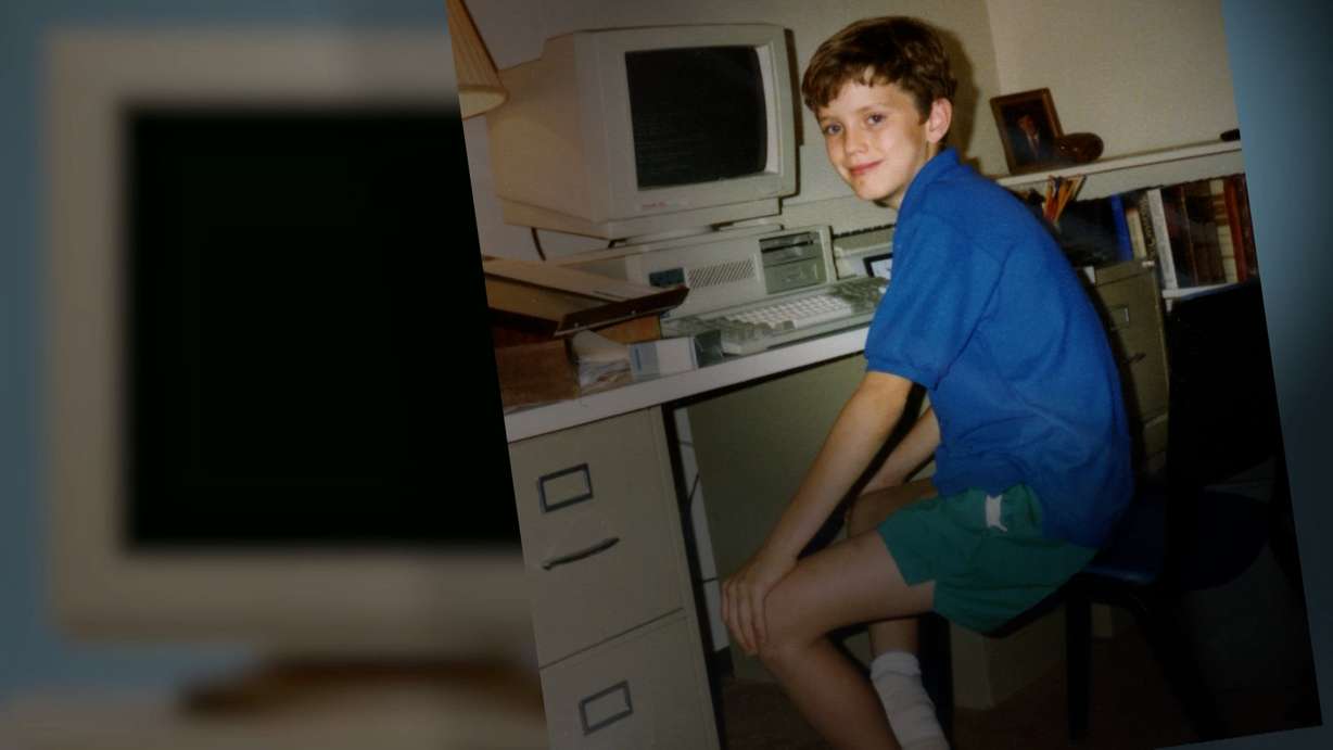
"I've loved typography probably from a very young age," Thomas said. "Some of my earliest memories are getting to type documents on my parents' early computers and enjoying the thrill of changing the fonts."
Typography, he said, isn't just a matter of aesthetics.
"Fonts have meaning," he said. "Fonts have embedded cultural values and ideas in them."
Futura, at different times, has meant different things, he said.
"I think honestly Futura has been so used by tech companies … that it speaks to both modernization, which I think is what they want. … It also means it's sort of our tech overlords in some ways. So I think it doesn't have quite the same rebellious modernism as it might have had in the '20s and '30s and speaks now more to a certain uniformity of our tech world that we belong to now."
(Thanks to Audrey Moss for her photo of Cooper Hewitt, Russ, and Daughters for an image of their sign, Sxenko and Mirkur for their pictures of the Wright home and the Bauhaus chair, Ben Franske for his subway photo and also the Newberry for images from font catalogs.)


